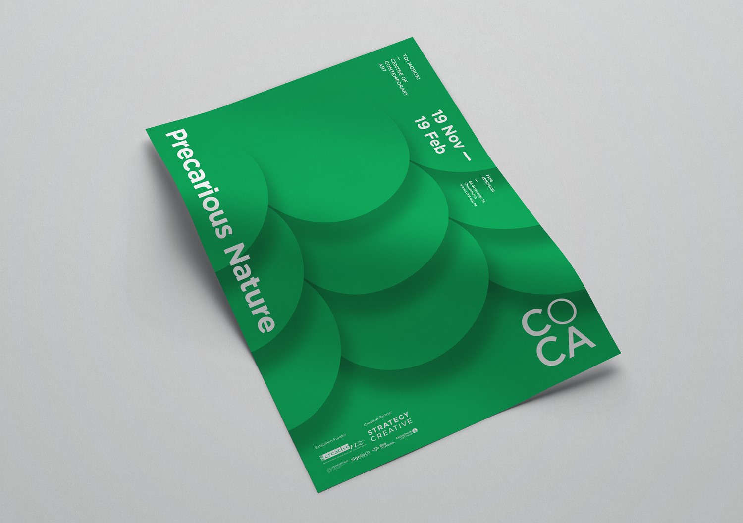
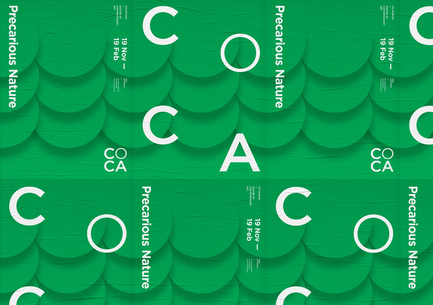
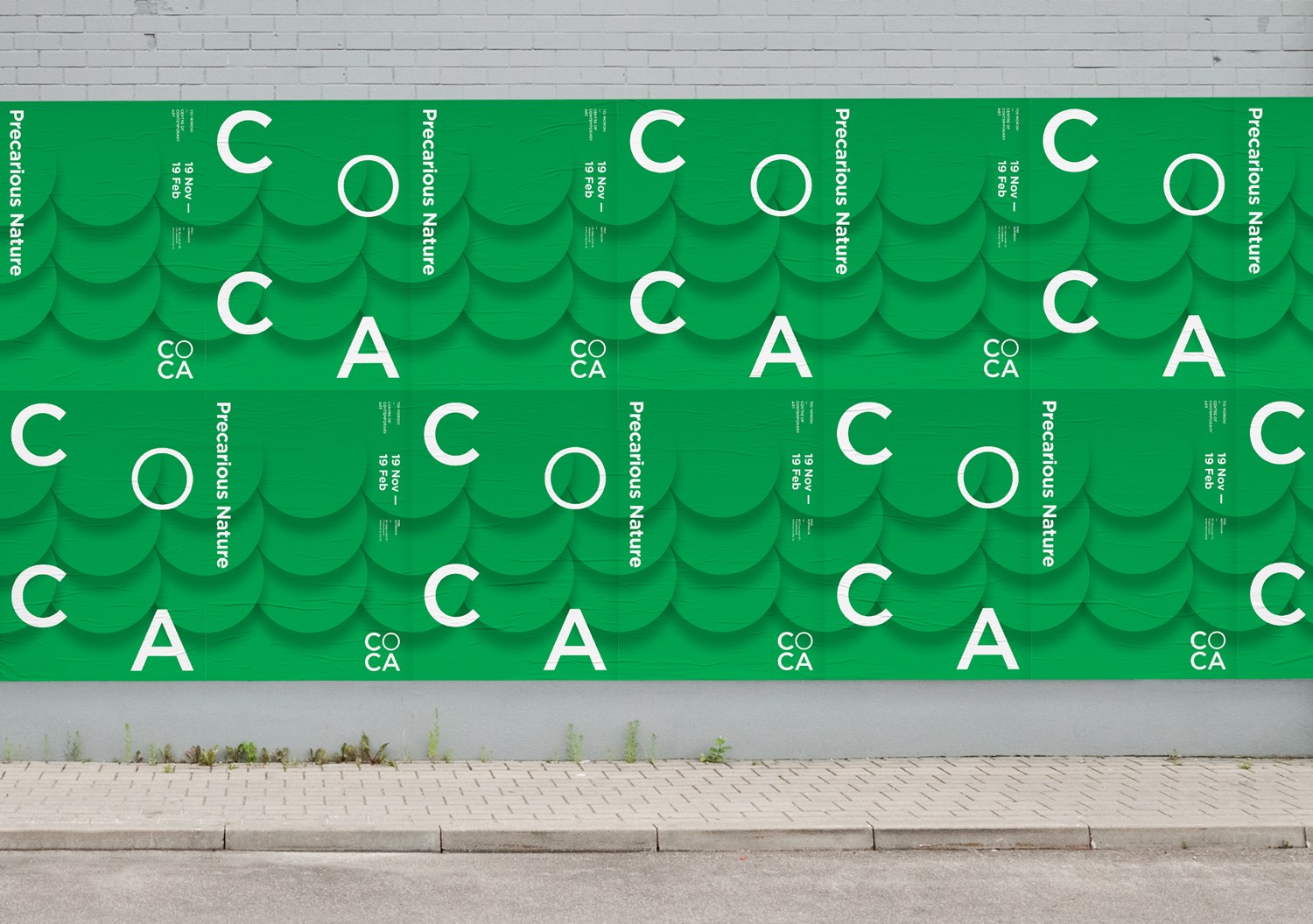
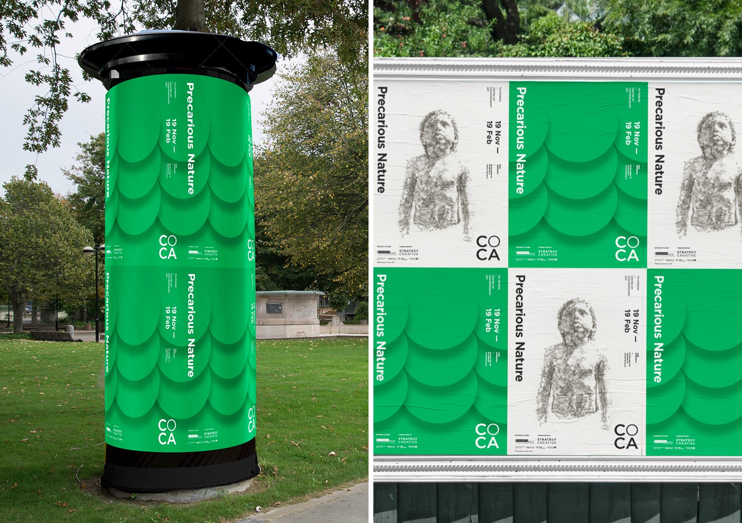
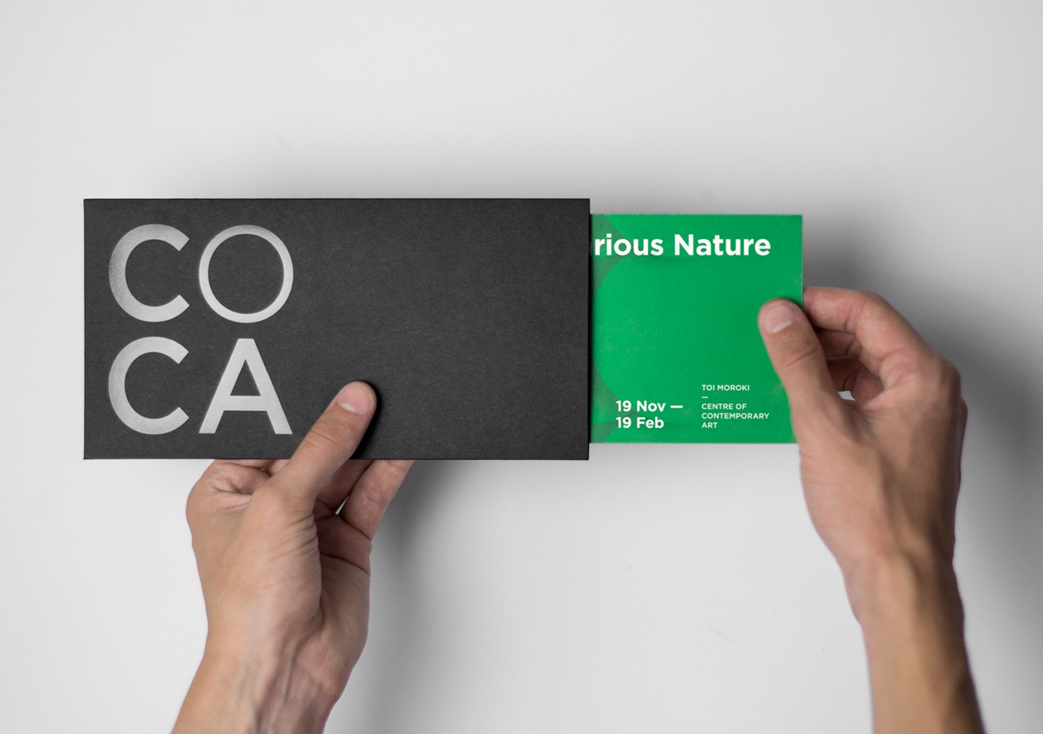
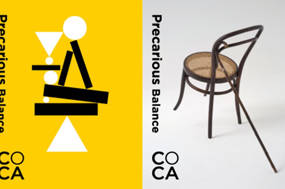
Our identity for the CoCA show, Precarious Nature, represents the fourth iteration of the campaign design system we developed for the gallery. From day one we have taken the geometric icons of circle, triangle and square and played with them in new ways for each exhibition.
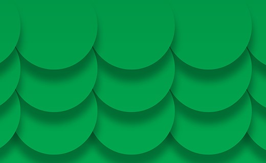
Every show offers a new creative opportunity that builds the brand while retaining its own distinct appeal. For Precarious Nature, an overlapping set of circles can be interpreted in a multiplicity of ways — scales on a fish, or leaves about to fall. On bollards, this anamorphic approach gives the impression that the street is being taken over by nature. Online, subtle animation has the circles blowing in the breeze.
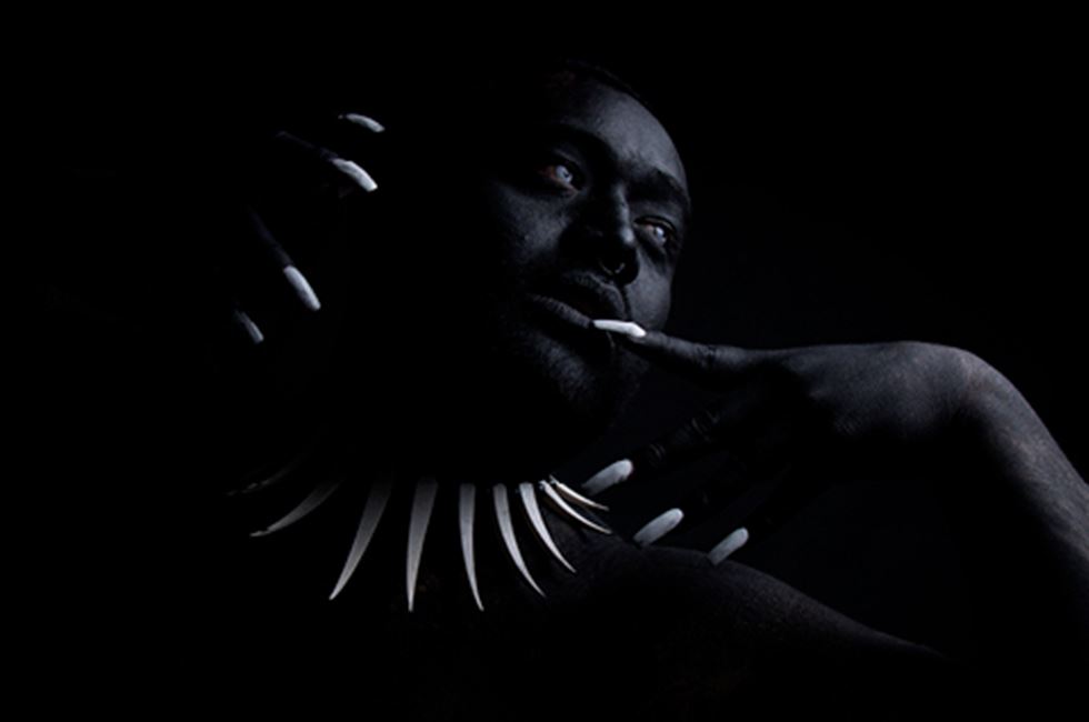
Always mindful that the campaign needs to remain in service of the art, the approach is thematic yet not prescriptive. Artwork images are given their own prominence and tied to the campaign on the strength of the supporting typographic system.
